
Project overviewToday, the process for assessing investment aptitude is qualitative and unscientific, it relies on recruiters, reference checks. This makes It difficult to determine if a portfolio manager’s performance is attributable to skill or luck. So that’s why we designed TalentStat, A “Content as a service” product for identifying elite investment talent scientifically. TalentStat is the unparalleled skill-based prefire assessment developed for assessing portfolio managers, specific for decision-making capability.
Team& RoleTeam Members
Rasheed Sabar - Product Owner
Haris Jaliawala - Product Manager
Weiheng Qian - Lead Product Designer
Tuly Jahan - Visual Designer
Tong Zhan - Content Strategy
John Davis - Lead Software Engineer
Junaid Nomani - Software Engineer
Charlie Russo - Software Engineer
Miriam Frank - Software Engineer
My Role: My main responsibilities include product design strategy&vision, design principle, wireframing, prototyping, usability testing, Visual design, and quality assurance.
Phase One
Strategy & Vision
This is a very fast pace project with limited resources, we were aiming to design and implement a brand new product and launch it in 3 months originally. The challenge I was given is “Design a trading game that can assess the decision-making capability of portfolio managers”. So during this phase, my main goal is to understand the context of where this product operates and develop a shared design strategy& vision across the team.
The problem in the marketThe selection process of the portfolio management aptitudes is far less sophisticated. The approach has not evolved in decades: firms rely on recruiters and interviews, personality tests, and reference checks. These strategies are commoditized, subjective, and prone to cognitive bias.
The Core capability we owned
01.
Successful methodology and framework in skill measurement.
We believe that the best way to measure core aptitude for complicated tasks is to break that task into constituent, atomic workflows that can be precisely measured. We’ve developed and iterated a very successful framework in measuring the skills of data scientists, researchers, and fundamental analysts.

02.
A scalable SaaS assessment platform.
As one of the C1 core products, We’ve designed and launched an assessment platform with sophisticated interfaces, smooth user experience, and robust operating systems. And the platform is easy to scale and build a new content on top of it.

03.
Rich domain knowledge and relationships
As a 10+years experienced senior portfolio manager, our product owner has built a solid understanding of portfolio management and developed a good relationship with the industry leaders include top investment firms and investment experts.
Product Strategy
01.
The product should easy to use
To most customers, Experiencing an autonomous delivery service is very unusual and new, So at least we should design this product easy to understand and use.
02.
The service should be reliable
Reliable in self-driving delivery service means users should be confident about their actions and clear on what they are waiting for and how long it will take.
03.
How smart it is, how good the service is.
The top-level thing we want to accomplish is to convey a strong signal to our users in terms of how robust the whole service and how smart the self-driving car can be.
Phase Two
Design & Prototype
Sketches & user flowOutlining the experience
From Quickly sketching out UI needed for shopping and delivering flow, to taking user flow diagram of the whole service tasks, Sketching out full flows was the first step before anything went into a computer especially for redesigning an existing service. It also gave our team the flexibility we need to think broadly.

Wireframes & prototype

Design Principles01.
Simplicity in Experience
People are overwhelmed with choice. We want to minimize and provide a simple, clean way to get from point A to point B in our services.
02.
Transparent on costs
We want to be very clear on all types of costs during our service, the cost not only means the expense of grocery, delivery, but also means time, and effort. Because in some cases, the delivery service with self-driving cars can be very expensive.
03.
Helps accessible anytime
We hope that users can experience the new technology confidently. Therefore, the reliability of the entire service is very important to us, which requires that users can easily access customer services anytime by our application.
04.
Clear on every phase.
Explicit instruction on how to interact with the self-driving car is the key to a smooth experience.
Design iterations01
Order status
Unlike most delivery app, the service provided by autox is based on driverless cars. There is no assistance from anyone else during the whole process, so when designing the experience, we need to clearly guide users to achieve each task.
By reviewing the user flow diagram, we can learn clearly about A)What users need to do, B)what they need to know ahead of time, C)what kind of assistance they will need, and D)what are their goals at each phase. So all the information needs to be presented on our interface.

The above shows the first 2 iterations of order status page, We put order tracker, pickup instructions unlock button all together. But when we did testing, we realized there are 2 problems.
We still lack certain information.
Information not presented at right time
So we carried out the third iteration, we separated the order tracking experience and delivery pickup experience into two steps, The unlock button and the delivery pickup instruction are on one page, and the order details, tracker on another page. This iteration received positive feedback because we displayed the right information at the right time, aligned the interfaces with real-world user actions better.

02
Delivery options
As I mentioned early, the AutoX team tried very hard to provide delivery methods as much as possible, They thought users prefer more delivery options rather than fewer. But through our testing, I realized their hypothesis wasn’t correct because users are really struggling with understanding the differences between various delivery options, and the multiple choices increased the frictions of decision making, The more time our users spent on figuring out the delivery method, the more chance they will dropoff, and the experience is very poor in those situations. So I choose to simplify the delivery method, fewer options, better experience.

03
Branding reassociation
One application for both food and grocery ordering and delivery causes the issue of understanding of the product purpose, It provides a poor experience that one product solves multiple problems, and also very hard to target the right user groups. So I made a proposal that divided AutoX application into 2 apps, one for grocery ordering and delivery, and another for food specifically.

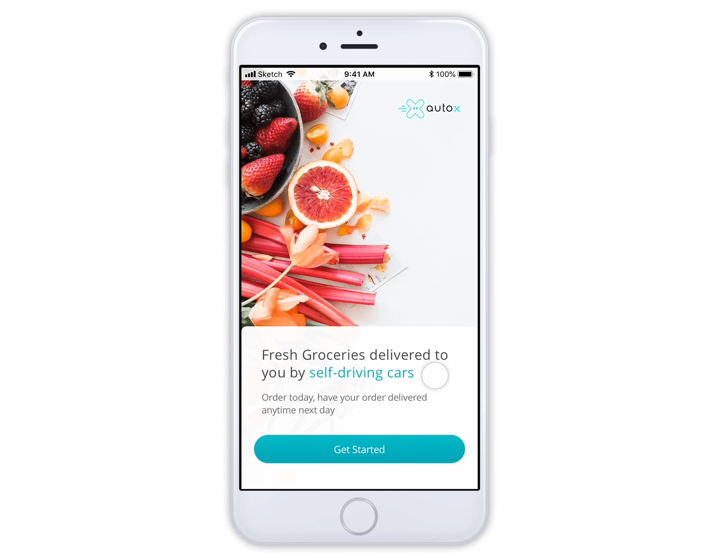
Visual designLogin
Due to the limited service area during the pilot testing period, we want to clearly communicate it as early as possible, so we required users to input their addresses during the login process. The reason we put email addresses first because we also want to acquire the people who interested in our service.
Shopping
We provided two types of services at this time, one is grocery ordering & delivery, another is food ordering & delivery.


Check out
I hope that our checkout experience is smooth, seamless, and intuitive. We shouldn't let users feel any confusion in the experience just because our service is based on autonomous driving technology. So in design, we simplified the process and removed redundant choices.
Confirm product quantity.
Choose a delivery time and review the delivery address and other information.
Place order.

Unlock
When the car is successfully delivered to customers location, we will inform users and educate them how to pickup their orders through our app. So the design at this phase is extremely important because it really is an essential part of this unique experience.

Phase Three
Dev Support
Design system